


One of the important choices in architecture are colors, which can have a positive or negative effect on the human psyche. This article examines the psychology of colors in architectural design .
What you read in this article :
- Color in architectural design
- Psychology of color and its application in architecture
- Psychology of neutral colors
- The effect of colors in interior decoration
- The importance of color palettes in architectural design
- Conclusion
Color in architectural design
Color has a direct impact on human life, while we may not spend much time choosing the color of our environment and home. Colors can transform our thoughts. Color is an inseparable element of life .
Color theory is very important in architectural design and has a deep impact on human feelings. The purpose of using colors in the design of an architectural space is not only to decorate it, but colors are able to engage the vision and create a feeling of peace or anxiety by processing it by the brain .
Read more : Continuous development of architectural modeling software in the world
Color and architecture are intertwined, and the designer must consider the effect of color in each element of the building; From basic building materials such as wood, stone, brick, etc. to the color of doors and windows. Color affects different types of surfaces and creates different visual effects. Color can show details or visually highlight certain aspects of a space .
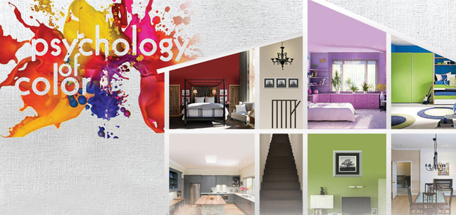
Psychology of color and its application in architecture
In the rest of the article, we will discuss the effect of primary and secondary colors. In modern psychology, colors are one of the criteria for measuring personality, because each of them leaves a special effect on the soul and body of each person and indicates his mental and physical condition. Colors are divided into three categories: warm, cold and neutral colors .
Green, purple and blue colors are cool colors and warm colors include red, yellow and orange. Warm colors are more dynamic and create a feeling of comfort and stimulation in people, while cool colors have a softer, more calming and still effect. Therefore, creating a color palette is a possibility to create different feelings in a space. In the following, we will examine the psychology of colors in more detail .

🟡 Yellow color: the color of optimism, curiosity, cheerfulness and creates a bright atmosphere. It is used in commercial spaces or restaurants to attract the attention of pedestrians. This color increases self-confidence .
🟢 Green color: creates a sense of peace and well-being. This color is mostly used in spaces related to health and well-being, such as hospitals and rest centers. Green is the color of balance and order and is abundantly seen in nature .
🔵 Blue color: conveys feelings of positivity, self-confidence and security. It is often used in commercial spaces such as airline agencies, banks, offices and companies. Deep blue color stimulates thinking and pale blue calms and concentrates the mind. In general, it can be said that blue is a cold and unstable color .
🟣 Purple color: conveys comfort and softness and is mostly used in hotels. It is an introverted color and encourages deep thinking .
🔴 Red color: the color of energy, excitement and motivation; Therefore, it is used in commercial spaces, such as stores or fast food, because it increases the desire and enthusiasm of the consumer. Red color creates a sense of anxiety and violence. Red has the longest wavelength and that’s why it attracts people’s attention . The reason why this color is used in traffic lights all over the world is its attention-grabbing property .
🟠 Orange color: obtained from the combination of yellow and red. Orange creates creativity, euphoria and enthusiasm. This color is often used in environments such as offices, studios and schools. The combination of orange with blue conveys confidence and color balance .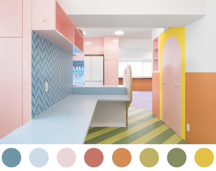
Read more : home decoration from design to renovation of old house
Psychology of neutral colors
⚪ White color: In general, white color indicates cleanliness. White is considered a summer color because it reflects light. In terms of color psychology, white expresses purity, and from a visual point of view, white gives an increasing understanding of space .
⚫ Black color: Black represents dominance and power. Black color is completely absorbing. From a color psychology perspective, black creates protective barriers because it absorbs all the energies that come your way and hides your personality. Black is essentially the absence of light, because it does not reflect any wavelength .
The effect of colors in interior decoration
In addition to the beauty of the appearance, colors can also be effective in adjusting the light of the house. If we use dark colors, the interior looks darker; Meanwhile, bright colors increase brightness, reflect light, and cause light reflection. According to the taste of the user’s needs, the designer uses colors in decoration .

The importance of color palettes in architectural design
In architectural design, the variety is infinite, there is contrast between different materials and colors, different trends such as pastel or neon colors, etc. In any case, colors are an essential tool for intensifying or reducing the presence of elements, facilitating or complicating the environment .
Basics of color theory: how to use color in interior design?
Many of us prefer certain colors based on what we perceive emotionally or after researching interior spaces. Did you know that there is a process for understanding colors and pairing them?
If you are an interior designer or look at design as a hobby, consider this article a crash course in color theory for interior design .
What is color theory?
Color theory comes from the color wheel. This theory is not just a random palette of colors. Specific definitions, guidelines and rules in visual arts allow designers to communicate with their users with attractive color combinations .
In other words, color theory is a science in which colors are well combined, and then the art of putting them together makes color theory .
The color wheel was developed by scientists and artists and is also attributed to Isaac Newton .
Artists and designers learn about colors to create a framework and foundation for their artwork or design. Understanding the color wheel is the basis of color theory .
How does color theory help in interior design?
When it comes to interior design, understanding color theory helps with color coordination. Choosing the right colors becomes necessary, because colors can affect the mood, add to the space and affect the feeling of the person .
Colors play a major role in human psychology and emotions. People often design different parts of their spaces in different color schemes to create different spaces and moods .
For example, use lighter colors to create a relaxed and open feeling, or use darker colors to make a bold statement .
Deciding on a color scheme for your interior can be stressful and exciting. It is important for interior designers to have an excellent understanding of the color wheel .
Basics of color theory for use in interior design :
1- Color wheel
The main colors: red, yellow, blue are the basis of colors .
Secondary colors: The combination of primary colors creates secondary colors such as purple, green and red-orange .
Tertiary colors: You can create tertiary colors by combining secondary and primary colors or primary colors in a ratio of 2:1 .
2- Color scheme
Creating a logical combination of colors through the color wheel is known as a color scheme. When it comes to color style and color appeal, a design provides the right aesthetic .
Examples of color schemes are as follows :
Monochrome: Various colors of one color create a monochromatic design .
Similar color scheme: Create it using colors that are next to each other on the color wheel .
Triad: You can create this triad from colors that are evenly spaced on the color wheel .
Complementary: These are the colors on the opposite side of the wheel. By mixing two of these colors, the result will be a muddy brown color .
Tetradic: types of binary colors are equally distributed in the color wheel .
Complementary division: Two colors are on opposite sides of the color wheel, one of which is divided into two adjacent colors. For example, yellow-green .
3- Color warmth
On the color wheel, there are warm colors around a certain color. In determining the heat of the color, you should pay attention to the location of the color on the wheel and its proximity to blue and yellow .
Warm colors: yellow, red
Cool colors: blue, green
4- Color combination
Adding any three primary spectral colors (red, green, or blue) to any other color, along with white, creates a color combination. Creating combinations includes a color cycle that starts with primary colors and goes to secondary and tertiary colors .
5- Psychological effects of colors
Did you know that colors evoke emotions, affect mood and set the tone?
Warm colors such as red, yellow, orange are often associated with love, passion, anger and happiness. Cold colors such as blue and white are associated with peace and tranquility and have a calming effect .
6- Color background
According to the context of color, color has different meanings in different settings. Therefore, colors can evoke various feelings and emotions and have different consequences in different contexts .
Read more : The most famous Sketchup plugin for rendering and how to make grass material
7- Color combination
As an interior designer or a homeowner looking to spruce up your home, it’s important to know what colors go well together and how to get more shades out of each color base .
Colors: refer to the colors in the color wheel .
Tones: The ratio of black and white added to a color saturates it and creates a tone .
Tints: When you add white to a color on the wheel, it lightens the color and gives it a more pastel or subdued shade. This lightening of the color is called a tint .
Shades: Adding black to a color on the color wheel gives the color a shade. Shades depend on the proportion of black added to a certain color .
8- Square color scheme
A square color scheme uses four shades of color that are evenly spaced on the color wheel. Each square color scheme contains a primary and secondary color and two tertiary colors, regardless of their position on the color wheel .
The intensity of the selected colors may vary depending on whether the selected colors are bold or neutral. As with the triple color scheme, interior designers usually try to achieve an equal variety of warm and cool colors by choosing one dominant shade and three shades that emphasize the dominant shade .
10 golden tips for using the basics of color theory in interior design
- Choose any color: Use the psychology of color to understand the needs of the client or the space needs. Once you have selected a color, then use the color wheel to select a defined color .
- Choose a color scheme from the largest pattern or element in the space .
- Dark-to-light-vertical: Many interior designers use the dark-to-light method vertically throughout a space or room .
- Refer to the color wheel .
- Don’t be afraid to go gray! Gray is considered one of the most stylish neutral colors. It works well with different interior styles: modern, victorian, velvet, plain, etc.
- The 60-30-10 rule: This rule means that 60 colors make up the dominant walls, 30 are secondary colors, usually for upholstery, and 10 are accent colors used for accessories. This ratio helps to maintain balance .
- Contrast between warm and cool: neutral colors help create a sense of balance and harmony in the environment and can be well combined with warm and cold colors .
- Monochrome look: Small spaces work wonders with a monochromatic look .
- Get inspired by personal style: what sets one home interior apart from another – how it’s decorated. Take inspiration from your client’s style to decorate. Evaluating individual styles helps to achieve color combinations and understanding of color background .
- Use color based on emotions .
Conclusion
Have you ever thought that colors can be so important?
Color theory is essential and valuable for understanding how to put colors together. An interior designer spends considerable time learning how to use the color wheel to their advantage .
Effective use of the color wheel to combine colors in the right context and create an excellent color palette for every room and interior space is one of the main distinctions of successful designers in the world .
Are you excited about putting colors together?
Now that you have mastered the theory of colors, it is time to explore the infinite world of colors !
Colors can have a significant effect on people’s mood. Colors are factors that affect the feeling we feel in the environment and become a means to influence the user’s behavior .
The use of certain colors can bring different meanings, far beyond aesthetics, covering other fields such as psychology. Therefore, it is clear that a color does not only depend on the light and environment, but also depends on the perception we have of it .


No comment